Yesterday, after lunch with CK, I ambled back towards work and was stopped short by a van on which was embossed the following legend: Stephen Austin, since 1768.
Well, you know what's coming next, eh? I had to learn a tad more about this enterprise, all of 240 years old. They, I find, are a private printing outfit based out of Hertfordshire, have a Royal Warrant for printing services to the Queen, were patronised by the East India Company, produced books for the East India College, and have been associated with such literary phenomena as George Bernard Shaw and Kalidasa.
What's that, you say? Kalidasa? It turns out that in 1855, Stephen Austin and Sons published a richly decorated volume of Sakoontala, recently translated by Professor Monier-Williams.
This work was printed in up to five colours by letterpress, with the binding matching the richness of the interior. It consisted of an elaborate Oriental design blocked in gold on leather and one edition (the open copy shown) was remarkable as being one of very few commercial editions produced with goffered edges – not merely gilded but decorated with the impression of heated tools. 0
 The edition won widespread acclaim for the typography. Indeed, Stephen Austin had long been lauded for its specimens of Oriental printing. Both Queen Victoria and the Empress of the French awarded the company gold medals, the latter following the brilliant Paris Exposition in 1856, where the book was exhibited.
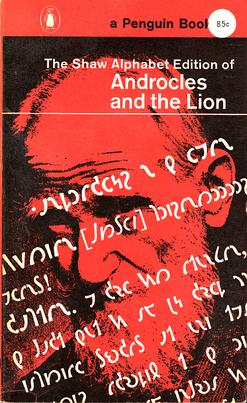
In 1957, Bernard Shaw left a bequest of £500 for the development of a new alphabet in order to simplify the teaching of the English language (the alphabet that we all use being completely non-phonetic). Besides his classical example of ghoti that could be pronounced as fish, he found the illogicality of similar spellings for words such as tough, cough, plough, and through infuriating. Another benefit of a more systematic script, Shaw claimed, was that printers could save paper because the words would now be shorter. His estate announced a competition to develop a new script of at least 40 characters, and although over four hundred proposals were sent in from all over the world, none were deemed to meet all of Shaw's requirements. Four finalists were chosen for their outstanding merit, and the prize was distributed amongst them. In 1961, Stephen Austin was commissioned to cut the blocks for Kingsley Read's script 1 of Shaw's alphabet 2, which was to be then used to print Bernard Shaw's Androcles and the Lion. The reproduction of two pages of the book illustrate the economy of space in using the new alphabet exactly as required by Shaw in his will. The Alphabet Reading Key and the Alphabet for Writers was also enclosed in each copy sold. 3
References
0. Stephen Austin and Sakoontala
1. Read, K. Sound-writing 1892-1972: George Bernard Shaw and a modern English alphabet, Journal of the Simplified Spelling Society, J23, 1998-1, pp3-7.

0 comments:
Post a Comment