JOST A MON

The idle ramblings of a Jack of some trades, Master of none

Nov 16, 2009

55 Broadway

What is the result of one of the most successful rebrands in design history? What made London Transport so easy to use, so cherished by the millions of commuters who travel by it? Where does Art Deco come into this story? In a recent programme on BBC Four titled Art Deco Icons, David Heathcote investigates the history of the famous London Underground, its logo and route map, its trains and stations, and talks about the wondrous building that is at its heart: the headquarters of this organisation atop St James’s Park station. 55 Broadway. This is a paraphrased transcript of the show.

HQ bw In 1929, the building that stands here would have been the nearest experience for a Londoner to an American skyscraper. The Underground arrived directly beneath the building, and one could come the stairs and turn directly into the offices of London Transport. There were shops at this level, multiple exits out of the station; there is wonderful Art Deco detailing, classical columns in travertine marble; a big entrance hall protecting one from the elements; a clock with a jazz sunburst behind it right above the doors leading into the offices; the whole thing screamed modernity, sophistication, technical excellence.

control Entering the office lobby, the bustle of the entrance hall dies away, and one is filled with a sense of purpose, of control.  On the wall are machines that tell the viewer to position of every train in the system, and the intervals between the trains. But that’s not all they do – they also give the illusion that the building is quietly, efficiently and solidly organising the transport of London. This is where it’s all made apparent, the language of control.

The walls are of travertine marble, with the grain of the stone leading sideways, providing a sense of flow; they look like rivers frozen in stone. And this motion is, of course, what this building is all about.

After the First World War, the many companies that ran the various lines of the Underground network were amalgamated into one structure. By the 1920s, the Underground Group organised Britain’s first truly modern transport system – not just trains, but also buses, and combining as well the design and engineering and technology and branding. The hub of the system was its new Art Deco headquarters at 55 Broadway in the heart of Westminster.

lift In the lift lobby of the building, a lovely space, is a really American, compressed version of the spaces one associates with the skyscrapers of Chicago and New York. In particular, reminiscent of the Empire State Building is the vertical display that tells one where the lifts are. It may only go up to ten floors, but the up-thrust and narrowness suggests a rapid climb, a tower block of great height. The lift lobby has other design touches – bursts on the wall rendered in bronze, indirect lighting via inverted hemispherical shades – all suggestive of that same modernity. By the time one arrives at this lobby, one has already passed through much of the ground floor of the building, the shops and the transport and the arcade: everything is indoors, an entire block.

55 Broadway was big, bold, modern, and much of the pleasure was in the Deco detail. Even the little-visited parts of it are lovely. The use of the travertine marble suggests vast indoor spaces, flat and neutral; but the plainness is brought to life by highlights such as the bronze balustrade along the stairs, shined up to gleam like gold, with an oft-used Art Deco sunburst motif whose rays propel one up and away. Further up the stairs, the marble gives way to tile, a square tessellation that offers hygiene, brightness, freshness and airiness.

Charles Holden The building was designed by the architect Charles Holden. He was influenced by American skyscrapers, and the Paris Exposition of 1925, the birthplace of Art Deco. His intention was to create a modern, functional building that provided a bright and light working environment focusing on the needs of the people who would use it. Among the ideas he brought in from America was the mail system – chutes through which mail could be dropped for collection and dispatch from the lower levels. mailchute Indeed, one can still see the labelling plaque: Cutler Mailing System, Cutler-Mail-Chute-Co. Rochester, NY, USA; and the language in the building suggests ‘We are American, we are efficient.’ America at the time was synonymous with the future, and much of the no-nonsense aura of efficiency was no doubt provided by the electric clocks everywhere.Paris Exposition 1925

Although 55 Broadway was Holden’s vision, it was the brainchild of the new Underground Group’s managing director, Frank Pick. These two men were pivotal in the development of London Transport. Together, they undertook a massive modernisation of all the assets of the organisation to make it fit for the 20th century.

Frank Pick Pick was a managing whiz, and while he could not do design, he knew exactly which people to bring in to sort out the buildings, the rolling stock, the textiles. A rarity among accountants, he kept abreast of the latest in European trends in art and architecture, he knew all the modernists, and was able to fuse their ideas with a kind of English modernity, which was almost medieval in its attention to detail and love of craft. Meanwhile, Holden designed and built many of the stations on the Piccadilly and Northern lines, working flat out from 1922 to the beginning of the Second World War.

Pick and Holden were very close associates, so close that they occasionally fell out. Indeed, once Pick threatened to sack Holden when he found out that the latter had given the design commission for Hampstead station to one of his junior architects. The problem was that this was Pick’s home station, and naturally he wanted the senior man to do it up as well as he could…

Roof Garden atop 55 Broadway The posh floor was the tenth, the topmost. The executive dining room is on it; the ceilings are twice the height of other floors, and there is a managerial roof garden! And as a tall building, 55 Broadway offered a reframing of not just offices and transport, but also luxury: height, being above everyone else, was almost the definition of luxury. Standing here in 1929, Pick and Holden could see that they had built a monument to the centrality of London’s transport: they were easily storeys above any other building in the district, and had splendid views across the metropolis.

When completed, this was a glittering white monolith, taller than anything else in London, a testament to the ambition and drive of the new organisation. It was modern and primitive at the same time and very American. Art Deco, of course, drew much inspiration from the primitivism of ancient cultures. Most obviously, the structure of 55 Broadway is reminiscent of a Babylonian ziggurat; equally, however, its situation on an entire block, squatting between streets, was a consequence of a design dynamic that originated in the USA in the 1880s, when the first skyscrapers were put up. 55 Broadway, then, is not a relic of Victorian, Dickensian Britain; it is the vanguard of a new, futuristic Britain. buildingview1buildingview2 buildingview3

Portland stone, the material of choice for British architects, lying somewhat between limestone and marble, and used extensively in 55 Broadway, epitomises the country, redolent of the White Cliffs of Dover, but also stuffed with fossils, and thus it combines ancientness and modernity. It is clean, modern, but suffused with the sediment of old Britain squashed into lumps of stone, and ideal for a headquarters: nothing says ‘stability’ and ‘forever-ness’ like this stone.buildingview4sculpture1sculpture2  

Holden intended the building as a new Temple of the Winds. Aware that it was likely to shock, he commissioned works by avant-garde sculptors like Henry Moore and Eric Gill to adorn each elevation. He chose Jacob Epstein, one of the most controversial artists of the time, to create two works, called Night and Day. It was a bold choice.  Jacob Epstein's Day

The one called Day, when it was put up, caused great offence, great scandal, because the penis of the boy clinging to his father was an extra inch-and-a-half longer, with the result that when the rain ran down it, water cascaded off its tip and onto the street. So an inch-and-a-half had to come off. sculpture4

The primitivism of the sculpture represents the power of electricity. Both modernism and primitivism talked about huge, uncontrolled forces. Electricity was akin to the puissance of ancient gods; in Epstein’s Day, the ancient, primitive god is sending his son off to his job in the world. Likewise, the Underground becomes the manifestation of a powerful heavy primitive god.

posters1 Crucially, Frank Pick understood the value of good design, and that the look of London Transport was its personality. He began the process of modernisation by commissioning painters for posters that would encourage commuters to use the system in their leisure time. In the 1920s, bright, colourful Art Deco designs produced by the best artists of the day were always given pride of place in the Tube stations. Pick understood just how persuasive they could be in persuading the public that this was a modern, forward-looking transport system.posters2 posters3 

In the London Transport Museum are over 20,000 posters from the various lives of the network. Those chosen by Pick from 55 Broadway were pivotal in the development of the Underground. Clive Gardiner was an example of an avant-garde artist employing some of the contemporary cubist ideas that struck a chord in the travelling public; another was Jean Dupas, who, like Gardiner, worked in his own style, and achieved much acclaim. The idea was to promote off-peak travel among Londoners; some of the posters targeted women, suggesting they were modern and independent and fashionable and could take in the city on a day out. The posters were placed inside the exits of stations so that people could see them on their way home: perhaps a glimmer of an idea of what to do on the weekend might then dawn in their minds. posters4
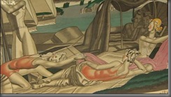
The posters were the starting point of one of the most radical redesign projects ever undertaken by a single company. Pick and Holden were able to do this because Art Deco is a total style, appropriate for all the company’s assets, from its headquarters on 55 Broadway to the smallest fittings on its station platforms, and so too the trains that ran on its tracks. rolling stock 1938One of the first trains that had all its running gears underneath it was the 1938 Rolling Stock which remained in use till the 1980s. It was styled in an Art Deco way, with Art Deco lampshades (called ‘shovel shades’ by workers on the LU), and the red-and-green seating fabric (called moquette) designed by the foremost textile designers of the day, people like Edith Marx and Marion Dorn; the overall effect of comfort and spaciousness that enticed passengers. passimeterFrank Pick had an idea of ‘fitness for purpose’, and these trains achieved much of that goal: technically better than the prior generation of trains, more comfortable, much more easy to use. Indeed, Pick, despite being extraordinarily busy at the upper levels of the administration, still took an afternoon off every week to go over the samples and design ideas that were being proposed by his commissions, and personally signed off the ones he felt were the best. That level of total control brought a sense of order to what used to be a disparate system in the decades before, and reassured passengers that they were getting a consistent service.

Other aspects of the total design overhaul were the kiosks for cigarettes and newspapers that used to be placed within the stations; the passimeter, the ticket dispenser and passenger counting booth; and, of course, the signage and plaques for information. The earlier signs were difficult to read, cramped texts in multiple fonts, very Victorian.old signage

Pick commissioned Edward Johnston, one of the leading calligraphers of the day, to design a new Underground font, a uniform typeface that enabled clear and unambiguous signage, including the roundel logo, all surrounded by much white space. new signage

During the 1920s and 30s, the Tube network pushed further and further out of dirty and crowded central London to new and leafy suburbs. It was Charles Holden who oversaw the design of new stations, which became increasingly radical for suburban London. As a result, London Transport’s stations number more listed buildings than any other public body in Britain. holden station design

Southgate is one of Holden’s stations on the Piccadilly Line. It was opened in 1933, and was considered one of his most dazzling creations. It had escalators, which were possibly the most modern thing the passengers had seen; the escalator tunnel was warm-lit, spacious and welcoming, taking the passengers up to the light; at the top, arriving at the main hall, one would see the relief-panel on the ceiling, like water radiating out after a drop falls in it. Of course, one is now en route home, after a long grimy day at work, and this was a wondrous welcome back. modernism southgate station

It is easy to be jaded by stations such as these today, but in the 1930s, these were the frontline of international avant-gardism, European modernism and Hollywood and the cinema, a touch of the future for the commuting classes of London. modernism southgate station 2modernism southgate station 3

From its heart at 55 Broadway to the very farthest reaches of the system, in the posters, the stations and the trains, Holden and Pick’s Art Deco designs enriched and advanced the lives of millions of people in the 1930s.  But London Transport’s bright new world still endures even now in the 21st century, fulfilling the purpose for which it was meticulously designed.

Aug 21, 2007

Numerically Typing

Came across a nifty piece on shifting standards in numerical typesetting.

If your numerals are embedded in text, use what the printers call old-style fonts: variable-width fonts with ascenders and descenders. For example, Georgia: 0123456789.

For standalone numbers, use modern fonts: fixed-width and equally sized. For example, Courier: 0123456789.

Helvetica is abhorred by business card makers because the constant-sized numerals make it difficult to differentiate among them. Check this out: 0123456789.

Interested in a brief history of typesetting? Here is an accessible one.

Apr 14, 2007

Math in a Blog

If there are physicists blogging away with the best of them, surely mathematicians can't be far behind? How do they all typeset all the formulae and algebra and equations? I'm amazed that a cutting-edge outfit such as Google still hasn't managed to incorporate a mathematical typesetter into Blogger.


A quick search (on Google, where else?) reveals that the Wordpress.com blogging site now supports an inline LATEX command parser. LATEX, as you all know, is the de-facto standard for mathematical publishing. I haven't used it since my M.Engg. thesis back in 1994, and am ashamed to say that I've chickened out of it recently, and have been formulising with Microsoft's Equation Editor.

A naive and ugly way is to write the mathematics in LATEX, convert it to an intermediate format (say, GIF?) file and import it into the blog.

Ostensibly, Google Docs can export documents to Blogger, but the former doesn't provide native math typesetting, so this project may be of some use. In my previous post on the Tengwar, I mentioned my frustration with the incorporation of that font into Blogger; this lack of mathematical typesetting is equally frustrating.

An alternative methodology seems to be the use of MathML. Firefox supports this natively. Wa-hey! So what now? This bears thinking about.

I see that Hindi transliteration in Blogger has been turned on. A brief frisson of excitement that ensued quickly decayed into deep gloom when I realised that, as usual, the world of Mac has been ignored. Anupama Dutta and cohorts at Google have done a stellar job of incorporating this interesting feature (machine learning and context-sensitivity! remembers user preferences and spellings!), but currently it only works with Internet Explorer and Firefox on Windows and Linux.

Right. So Tolkien, in his infinite wisdom and fecund imagination, concocted languages of superlative beauty and expressiveness. Not content with mere grammar and linguistics, he designed fonts as well. Or rather, he reported that Fëanor created them when he could spare time from his life's work - the Silmarils, wrought from the light of the Two Trees, blessed by Yavanna, coveted and stolen by Morgoth, and the cause of the long war and bitter defeat of the High Elves in Middle Earth.

Heady stuff. And considering that the appendices to the Lord of the Rings, and the Silmarillion, and the collected notes of Tolkien compiled by his son contain so much information on the languages of his worlds, one would think that there would be little more to add by others. But one would think wrong:
  1. A Dictionary of Sindarin
  2. All the languages of Tolkien.
  3. Fonts, galore.
I've been trying with a singular lack of success to post something in the Tengwar font. I even thought I could upload a document with the appropriate font into Google Docs. But no. All I get is: Words -- so innocent and powerless as they are, as standing in a dictionary, how potent for good and evil they become in the hands of one who knows how to combine them. [N. Hawthorne]