What is the result of one of the most successful rebrands in design history? What made London Transport so easy to use, so cherished by the millions of commuters who travel by it? Where does Art Deco come into this story? In a recent programme on BBC Four titled Art Deco Icons, David Heathcote investigates the history of the famous London Underground, its logo and route map, its trains and stations, and talks about the wondrous building that is at its heart: the headquarters of this organisation atop St James’s Park station. 55 Broadway. This is a paraphrased transcript of the show.


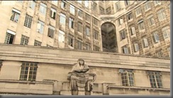
The walls are of travertine marble, with the grain of the stone leading sideways, providing a sense of flow; they look like rivers frozen in stone. And this motion is, of course, what this building is all about.
After the First World War, the many companies that ran the various lines of the Underground network were amalgamated into one structure. By the 1920s, the Underground Group organised Britain’s first truly modern transport system – not just trains, but also buses, and combining as well the design and engineering and technology and branding. The hub of the system was its new Art Deco headquarters at 55 Broadway in the heart of Westminster.

55 Broadway was big, bold, modern, and much of the pleasure was in the Deco detail. Even the little-visited parts of it are lovely. The use of the travertine marble suggests vast indoor spaces, flat and neutral; but the plainness is brought to life by highlights such as the bronze balustrade along the stairs, shined up to gleam like gold, with an oft-used Art Deco sunburst motif whose rays propel one up and away. Further up the stairs, the marble gives way to tile, a square tessellation that offers hygiene, brightness, freshness and airiness.


Although 55 Broadway was Holden’s vision, it was the brainchild of the new Underground Group’s managing director, Frank Pick. These two men were pivotal in the development of London Transport. Together, they undertook a massive modernisation of all the assets of the organisation to make it fit for the 20th century.
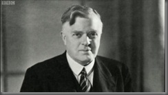
Pick and Holden were very close associates, so close that they occasionally fell out. Indeed, once Pick threatened to sack Holden when he found out that the latter had given the design commission for Hampstead station to one of his junior architects. The problem was that this was Pick’s home station, and naturally he wanted the senior man to do it up as well as he could…

When completed, this was a glittering white monolith, taller than anything else in London, a testament to the ambition and drive of the new organisation. It was modern and primitive at the same time and very American. Art Deco, of course, drew much inspiration from the primitivism of ancient cultures. Most obviously, the structure of 55 Broadway is reminiscent of a Babylonian ziggurat; equally, however, its situation on an entire block, squatting between streets, was a consequence of a design dynamic that originated in the USA in the 1880s, when the first skyscrapers were put up. 55 Broadway, then, is not a relic of Victorian, Dickensian Britain; it is the vanguard of a new, futuristic Britain. 

Portland stone, the material of choice for British architects, lying somewhat between limestone and marble, and used extensively in 55 Broadway, epitomises the country, redolent of the White Cliffs of Dover, but also stuffed with fossils, and thus it combines ancientness and modernity. It is clean, modern, but suffused with the sediment of old Britain squashed into lumps of stone, and ideal for a headquarters: nothing says ‘stability’ and ‘forever-ness’ like this stone.
Holden intended the building as a new Temple of the Winds. Aware that it was likely to shock, he commissioned works by avant-garde sculptors like Henry Moore and Eric Gill to adorn each elevation. He chose Jacob Epstein, one of the most controversial artists of the time, to create two works, called Night and Day. It was a bold choice.
The one called Day, when it was put up, caused great offence, great scandal, because the penis of the boy clinging to his father was an extra inch-and-a-half longer, with the result that when the rain ran down it, water cascaded off its tip and onto the street. So an inch-and-a-half had to come off. 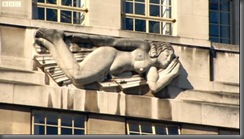
The primitivism of the sculpture represents the power of electricity. Both modernism and primitivism talked about huge, uncontrolled forces. Electricity was akin to the puissance of ancient gods; in Epstein’s Day, the ancient, primitive god is sending his son off to his job in the world. Likewise, the Underground becomes the manifestation of a powerful heavy primitive god.


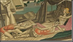
In the London Transport Museum are over 20,000 posters from the various lives of the network. Those chosen by Pick from 55 Broadway were pivotal in the development of the Underground. Clive Gardiner was an example of an avant-garde artist employing some of the contemporary cubist ideas that struck a chord in the travelling public; another was Jean Dupas, who, like Gardiner, worked in his own style, and achieved much acclaim. The idea was to promote off-peak travel among Londoners; some of the posters targeted women, suggesting they were modern and independent and fashionable and could take in the city on a day out. The posters were placed inside the exits of stations so that people could see them on their way home: perhaps a glimmer of an idea of what to do on the weekend might then dawn in their minds.
The posters were the starting point of one of the most radical redesign projects ever undertaken by a single company. Pick and Holden were able to do this because Art Deco is a total style, appropriate for all the company’s assets, from its headquarters on 55 Broadway to the smallest fittings on its station platforms, and so too the trains that ran on its tracks. 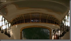

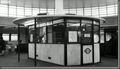
Other aspects of the total design overhaul were the kiosks for cigarettes and newspapers that used to be placed within the stations; the passimeter, the ticket dispenser and passenger counting booth; and, of course, the signage and plaques for information. The earlier signs were difficult to read, cramped texts in multiple fonts, very Victorian.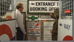
Pick commissioned Edward Johnston, one of the leading calligraphers of the day, to design a new Underground font, a uniform typeface that enabled clear and unambiguous signage, including the roundel logo, all surrounded by much white space. 
During the 1920s and 30s, the Tube network pushed further and further out of dirty and crowded central London to new and leafy suburbs. It was Charles Holden who oversaw the design of new stations, which became increasingly radical for suburban London. As a result, London Transport’s stations number more listed buildings than any other public body in Britain. 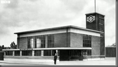
Southgate is one of Holden’s stations on the Piccadilly Line. It was opened in 1933, and was considered one of his most dazzling creations. It had escalators, which were possibly the most modern thing the passengers had seen; the escalator tunnel was warm-lit, spacious and welcoming, taking the passengers up to the light; at the top, arriving at the main hall, one would see the relief-panel on the ceiling, like water radiating out after a drop falls in it. Of course, one is now en route home, after a long grimy day at work, and this was a wondrous welcome back. 
It is easy to be jaded by stations such as these today, but in the 1930s, these were the frontline of international avant-gardism, European modernism and Hollywood and the cinema, a touch of the future for the commuting classes of London. 
From its heart at 55 Broadway to the very farthest reaches of the system, in the posters, the stations and the trains, Holden and Pick’s Art Deco designs enriched and advanced the lives of millions of people in the 1930s. But London Transport’s bright new world still endures even now in the 21st century, fulfilling the purpose for which it was meticulously designed.




8 comments:
lovely post, feanor!
Thanks, SB. But all praise must go to Mr Heathcote! I am merely a humble scribe.
oh yikes. how did i miss the 'paraphrased transcript' bit?!
I can tell you that these transcriptions are a right pain. But as I don't know if these programmes will ever be reissued on DVD, this is the only way for me to archive the deuced things...
i was actually going to ask you how you *do* do it - play it back section by section and transcribe? or do you have total recall?
wv: sundical (a suicidal sundial).
Total Recall, eh? Like Anand Squashvinegar?
BBC's iplayer allows all manner of back-and-forth-and-pause. Then I cunningly take screenshots and edit out the images I want. It's a chore.
Oh, man, this is awesome stuff.
//and hats off to you on your transcription process.
The London Transport Museum was one of the few I simply didn't have the time to visit. On my vext trip to London perhaps....
Post a Comment